*This article was originally posted at Sonicbids.com. It has been republished here with permission.
With Facebook‘s timeline layout, your cover photo is the billboard of your social media page. You can use it to communicate countless ideas, pitches, concepts, or products. The difference between your cover photo and profile picture is that your profile picture shows up in user’s feeds, whereas your cover photo only exists on your Facebook page. When your fans visit your page, you have a chance to communicate something important. So what should your cover photo look like, then? Switch out that trite band pic with one of these six creative (and effective!) ideas.
1. Put your tour dates front and center
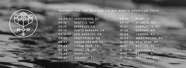 BANKS’ cover photo. (Image via facebook.com)
Your timeline photo is a great place to display what you’re currently working on in a billboard-style photo. If you’re touring a new album, create a compelling background with fragments of your cover art, and sprawl your tour dates across in a clean, readable design. The key is to make it visually appealing with traces of your music tethered into the design. Just having the dates won’t be enough. When Los Angeles-based singer BANKS went on tour with The Weeknd, she took fragments of her London EP cover and created a minimal, branded cover photo with her tour dates spread across her signature monochromatic image. The result is her EP artwork being extended into her tour promotions through her cover photo.
2. Create a collage
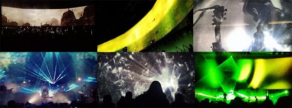
Sigur Ros’ cover photo. (Image via facebook.com)
The dimensions for of a cover photo are perfect for creating a collage of your band’s experiences and successes. When Sigur Ros launched their 2012 world tour, they used fan photos found on Instagram through their hashtag #sigurroslive and made a stunning collage of different shots from their live shows around the world. Their cover photo was particularly creative because it took fan art and exposed it to their worldwide following. Other collage ideas could be all of your albums to date or pictures of the band on the road.
3. Incorporate your profile picture
 Image via facebook.com
This is a popular trend, mainly because it’s clever and aesthetically pleasing. Social media users create a scene with their cover photo and use their profile picture to connect to the scene. It could be your lead singer holding a microphone in the profile picture, and the mic stand and the rest of the band performing in your cover photo. The key to this trick is a smooth connection. The colors should be the same, and the sizing should be exact. This might take a little trial and error, so be sure to design it and test it out first.
4. Have a call-to-action
 Sam Smith’s cover photo. (Image via facebook.com)
Your cover photo is a great place to ask your fans to engage with your music. Sam Smith used his cover photo to ask his fans to vote for him at the 2015 Brit Awards. He used the photograph from his debut album with a clear call-to-action for his fans to vote for the album. And of course, he put the link in the description. Like I said before, your cover photo is like your own social media billboard. Do you have something to ask of your fans? Come up with a creative design with minimal text, ask them through your cover photo, and always put further instructions in the description.
5. Promote a hashtag
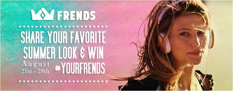 Image via facebook.com
Hashtags are the connecting points we follow to engage with fans. If you’re hosting a live-stream of your new album, create a hashtag for followers to use while they stream. They can tag their pictures and listening experience. Your cover photo is a great place to encourage your follows to use a trending hashtag that’s relevant to your music. Maybe it’s the title of your new album or your band’s name with 2015 attached. Either way, come up with a catchy hashtag that will bring new people to your music, as well as allow you to see who your fans are and how they engage with your music.
6. Showcase your audience
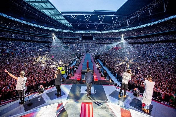
One Direction’s cover photo. (Image via facebook.com)
Your cover photo is a great place to showcase your audience. This is especially effective if the picture is from behind the stage, so the audience can see what you see while you’re playing live. One Direction took a photo from behind the stage at a massive arena show; the entire crowd was lit up, and fans tagged themselves in the picture. Give your fans a chance to tag themselves so they can document their memories through your cover photo. Find one of the best live photos from behind the stage – or even a photo you took from the stage yourself – and design it to fit your cover photo’s dimensions (851×315). Showcasing your audience and the excitement of your live show is always positive.
Have a cool cover photo idea to add? Share it in the comments below!
Sam Friedman is an electronic music producer and singer-songwriter based in Brooklyn, NY. His music blends experimental ambience with indie-driven dance music. In addition to pursuing his own music, he is a New Music Editor for Unrecorded and is passionate about music journalism. Check out his music and follow him on Twitter @nerveleak.
