Not all bands can afford to commission a graphic designer, and some lack the connections to link up with a rising artist who will work for trade or free. If that’s the case, you could be utterly on your own when crafting a business card. That’s okay, though. Anyone can learn the basics well enough to create a simple but effective design.
What you see in the steps below is a genuine example. I’m creating a business card for my music venue. To be clear, we aren’t endorsing a particular process here. There are heaps of software programs besides the one I use. The details and setup could be replaced with a zillion others that better fit your style and needs, and there are countless online printing services to choose from, too. We’re just hoping that by proving a novice user (me) can do this, you’ll find the gusto to try it, too. And with this step-by-step post, your software tutorials, and the tips your printing service provides, you should have everything you need get a basic but totally acceptable card ready.
1. Choose a printing service
Before tackling the artwork, figure out how you’re getting your business cards printed. We’re recommending handling this first to ensure you’ll create an image that meets all the requirements of a particular service. We’ve gone with Overnight Prints for its price, quality, and ease of use. A set of 100 full-color cards on the standard 15pt card stock costs about $20 for single-sided and $25 for double-sided. Its system is super easy to maneuver, and it even provides a sample card that helps you avoid common mistakes.
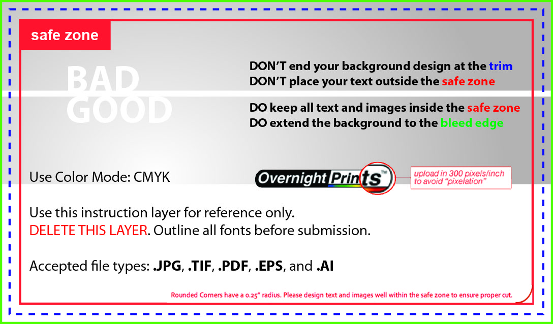 Overnight Prints provides a sample business card with markers to help guide your process. (Image via overnightprints.com)
Along the trim marks, which are in blue, is where your card will be cut. It’s not always perfectly precise, though, so it’s recommended to keep your text within the safe zone (red border). If you’re going to use a colored background or image, make sure it extends to the green border (full bleed). Not conforming to that requirement could mean unwanted white strips along the edges of your card.
2. Get the pertinent info ready
Here’s what you’ll want to include on your card:
- Band or artist name
- Facebook URL
- SoundCloud, Bandcamp, or YouTube URL and a corresponding QR code (optional)
- Email address
- Phone number
3. Map out your design
Try sketching your card on paper before working in a software program. You’ll find the process is faster and smoother if you’ve already got a good idea of how you’d like your information arranged.Your mock-up is a draft, of course, but it should be thorough. What background will you use? An image or a color? Are you including a photo of your band? Whatever graphics you choose, make sure they’re high-quality.
Generally, 300 DPI (dots per inch) will make for a clear image that isn’t pixelated or blurry. You can check the DPI in most imaging software programs, typically in the image specifications area that also allows you to make the image smaller or larger. If you’re not working with the right DPI, you can change it. There’s no visible difference as far as what you’re looking at, but trust us, switching to 300 DPI is a necessary step.
4. Prepare to design
Adobe Illustrator and Photoshop are the most popular imaging programs, but there are way more that – and for your purposes, many of them are totally suitable. I use GIMP, a free program that has a lot of the same features and plenty of tutorials available online for help and advanced learning.
 GIMP offers in-depth tutorials that can teach you fancier design techniques. (Image via gimp.org)
Since you’ve already planned out your design on paper, now is when you can think about secondary details like fonts and color schemes.
You can download free fonts from websites like Da Font and 1001 Free Fonts. Don’t get so excited by fancier styles that you use four different kinds or ones that become illegible at smaller sizes. It’s okay to use a fun (but easy to read) font for your band name, but stick to a plain type for the rest of the information. Tip: Install all fonts you plan to use before opening your software program. Otherwise, they won’t be available for you to use; you’ll just have to exit and reopen the program for them to be recognized.
There are user-driven websites like Colour Lovers where you can browse color schemes for inspiration. If the color code isn’t provided, save the image and use the color-matching tool in your software (in GIMP and several other programs, it’s an eyedropper) to load and save hues for your own use. You don’t necessarily have to blast the card with colors – I actually ended up using black and white only – but in certain cases, it can be a nice touch to use unique colors as opposed to the presets your software program provides.
5. Actually design
To ensure I’m abiding by all the bleed and trim requirements, I’ve opened the sample card provided by Overnight Prints in GIMP. I’ve also opened an image I plan to use: my bar’s logo. I then changed the DPI of the logo to 300 pixels per inch (image –> scale image) and copied it (edit –> copy visible), then pasted it as a new layer on top of the sample card (edit –> paste as –> new layer). The size was way too big, so I estimated and scaled it down a bit and moved it into the left-hand corner within the safe zone. It’s likely I’ll move it and maybe even scale it again, but for now, this size is fine.
I opened another new layer, but this time from scratch (layer –> new layer). I selected the foreground option, but really any of the choices – there’s also background, transparency or white– will work. As long as you leave the layer with the business card sample intact, you can view it when you wish and delete it when your work is complete. (You’ll be able to compare your text against the guidelines, too. That’s coming later.)
Using the text tool, I’ve placed my name using a font called Human Error, and beneath it, all of my information in a plainer font called Sparkler. I used right justification for each and checked their placement against the sample business card by hiding the layer with the black background. I dragged both text layers to the top of the list so they’ll appear over the sample business card layer, and with the black background hidden I could ensure they’re well within the safe zone.
I generated a QR code for my venue’s Facebook page on qrstuff.com – one of many free QR code services online – then downloaded and loaded it into GIMP. To fit in a little nook between my information and the safe zone, I resized it – but only minimally, because if it’s too tiny, it won’t scan. (By the way, I made that space in the text using the space bar – nothing fancy over here.)
 The end result. Not bad, right? It’s simple, but effective. (Image courtesy of Jhoni Jackson)
After checking my design multiple times, I’ve decided I’m done. Now, I can delete that sample business card layer (right click –> delete layer), export it as a .jpeg (one of several accepted formats), and upload to Overnight Prints for ordering.
That wasn’t so hard, was it?*
Have any other pointers for designing your own business card? Leave them in the comments below!
Jhoni Jackson is an Atlanta-bred music journalist currently based in San Juan, Puerto Rico, where she juggles owning a venue called Club 77, freelance writing and, of course, going to the beach as often as possible.
*This article was originally published at Sonicbids.com. It has been re-posted here with permission.